Reds Falling Flat? Here's How To Make Them Look More Expensive
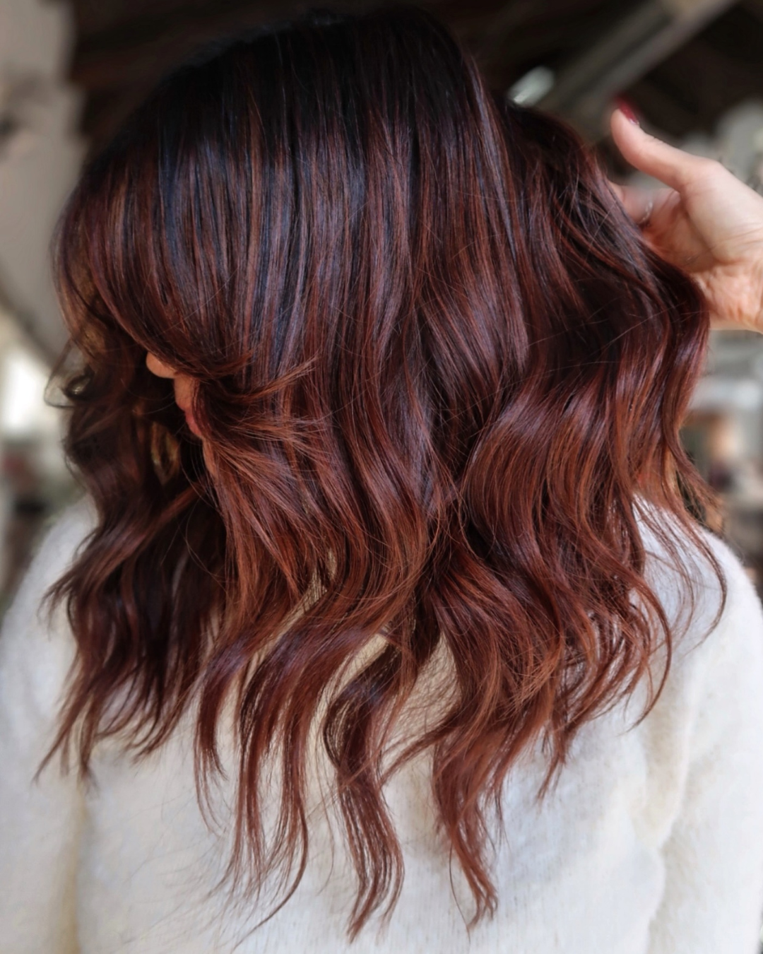
The difference between a flat red and a dimensional one isn’t just the formula; it’s every decision you make throughout the service. Contrast, placement, formulation and toning all work together to create richer, more expensive-looking results.
In her BTC University class, Multi-Dimensional Reds, Joico Artistic Director Larisa Love (@larisadoll) shares the techniques behind her signature high-impact color, from customized formulas and strategic foil placement to layered toning techniques that build depth, movement and shine.
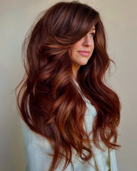
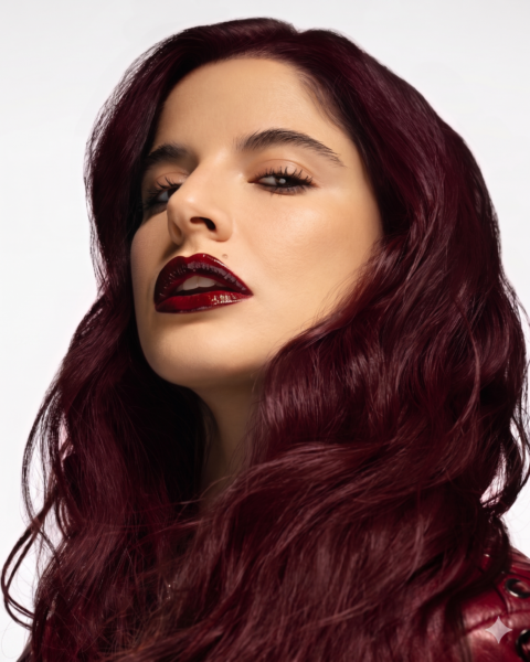
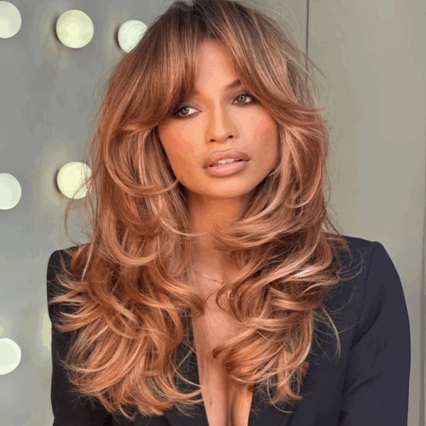
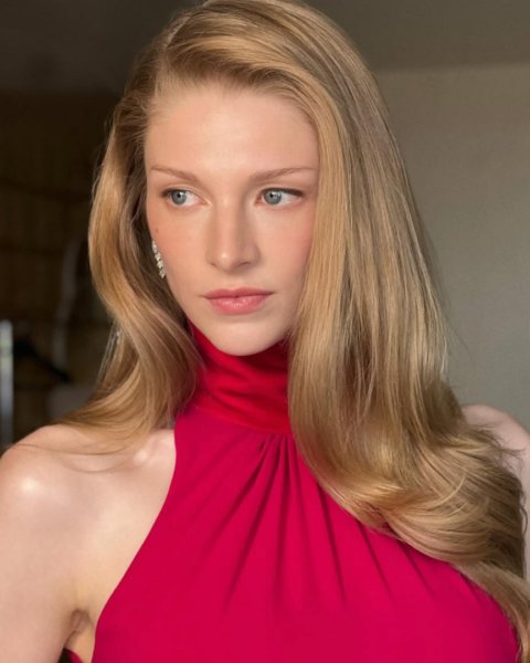
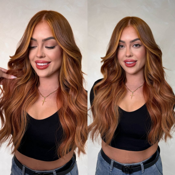
Below, Larisa shares the five techniques behind her signature red work. But first, tap through to see how she adapts them across a range of copper, auburn and red tones:
1. Build Dimension Into Your Formula
Instead of relying on a single shade, Larisa combines multiple tones to create depth and tonal variation before the color ever touches the hair. “I know that it can be intimidating to formulate with multiple colors, but this is what’s going to make your work stand out from somebody else’s,” Larisa explains. “You don’t want it to look like everybody else’s. You want it to be uniquely tailored for the client.”
Advertisement

To build rich, dimensional reds, Larisa often combines Joico LumiShine in the shades:
- 5NRv Natural Red Violet
- 5RR Red Red
- 4VV Violet Violet
“The LumiShine reds are very red,” she explains, “so that’s why I like to add a little bit of Natural into them.” She also incorporates violet to deepen the tone without making the finished result appear overly bright. “I love to add violet to my reds because I feel like it just kind of deepens them but still makes them look very rich and red.”
2. Leave More Depth Than You Think
“It’s very important that we’re not just over-highlighting. Really think of your placement because we want to make sure that we’re creating contrast. I like to leave a little lowlight out because I want that dimension to show through,” Larisa says.
By resisting the urge to highlight every section, Larisa gives the brighter ribbons something to play off of. That intentional contrast creates more visual movement throughout the color, making reds appear richer without adding additional brightness.
3. Let Your Teasing Create the Blend
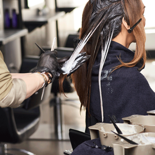
Teasing doesn’t just soften your blend; it determines where your brightness begins. “The more we tease, the lower the color will fall. The less we tease, the higher the color will be,” says Larisa. “So, we’re creating a shadow effect without having to rely on a shadow root by teasing it one extra time.”
4. Stagger Your Developers for More Even Lift
For even lift during longer lightening services, Larisa staggers developers in five-volume increments.
Advertisement

“I like to go up by my developers by five, so instead of jumping from 10 to 20, I like to go 10, 15, 20 [and] 25, so everything lifts nice and evenly and slow and steady. So when I finish with my last section, everything’s going to be lifted all evenly and at the same time,” Larisa explains.
5. Overlay Your Toners for More Dimension
Larisa treats toning as another opportunity to build dimension. “I always like to tone with two, just to add a pop of depth and brightness with my toners, and also I never tone with just one formula,” she says. “It’s so important to create customizable toners for your client that no one else can know or have, so that way your client will always come back to you.”
These techniques are just one part of Larisa Love’s Multi-Dimensional Reds course on BTC University. In the full class, she shares her complete approach to creating rich, high-contrast reds, including:
- Customized Joico formulations for dimensional reds
- Strategic foil placement that preserves depth and contrast
- Progressive developer techniques for more even lift
- Face-frame and money piece placement
- Overlay toning for richer, multi-dimensional color
- Product recommendations to maintain vibrancy between appointments
Press play to access the full class and see Larisa’s complete technique:


Join BehindTheChair
Access the industry’s #1 source for hair trends, education and community now.