
Joico’s Le Graphique 2010 Collection

Advertisement
Advertisement
Advertisement
Joico’s Le Graphique 2010 Collection
Joico’s New Collection for 2010 drew inspiration from legendary multi-media artist Serge Lutens. Here’s a peek at Le Graphique!
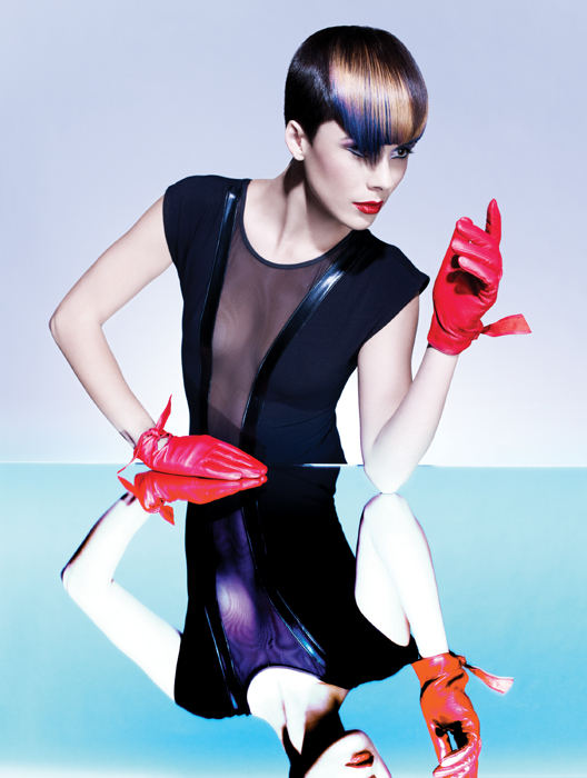
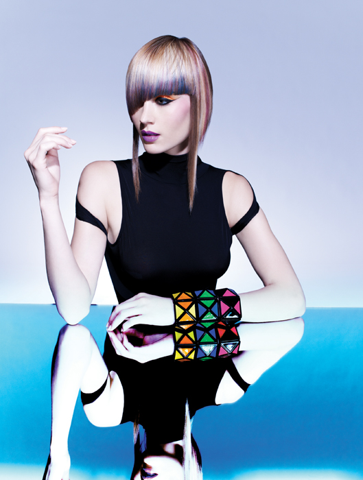
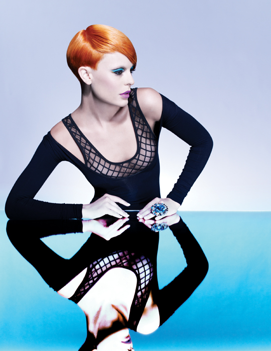
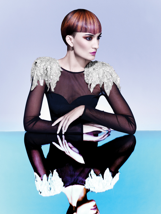
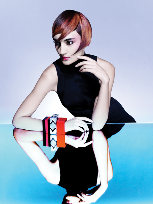
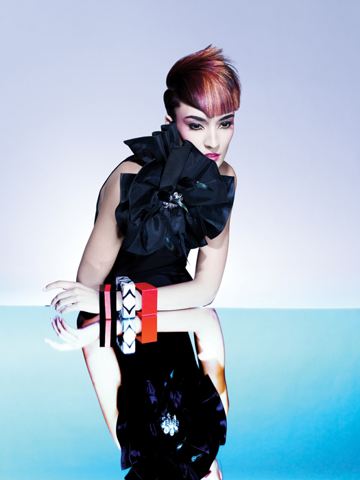
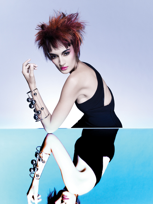
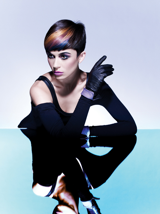
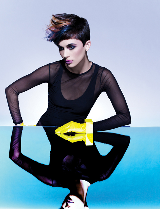
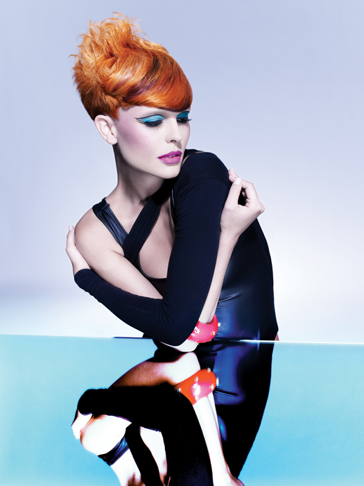
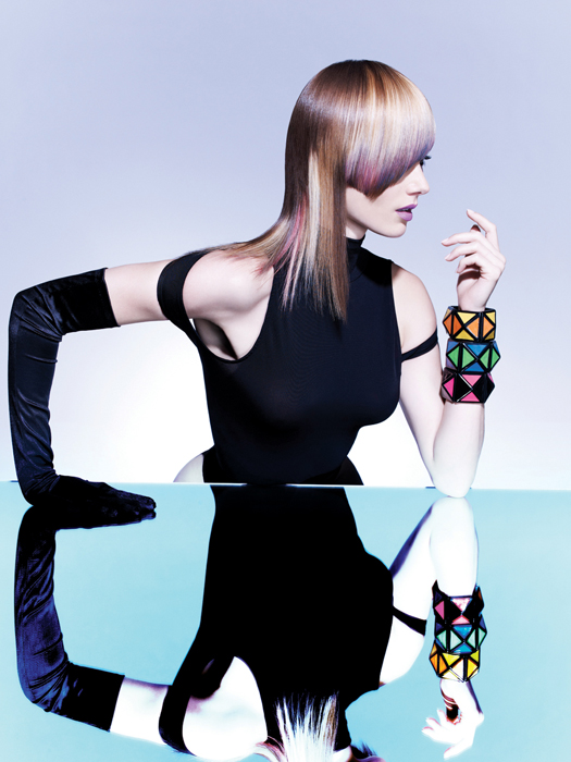
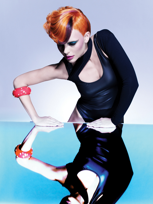
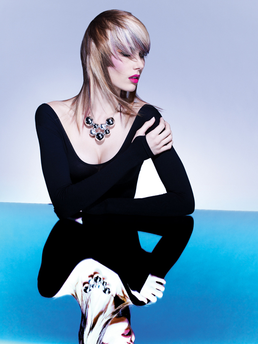
French hairstylist, makeup artist, perfume creator, fashion designer, art director and photographer Serge Lutens served as the creative director for Shiseido in the 1980s, and his images marrying graphic detail and otherworldly shapes enjoy iconic status in the worlds of fashion and beauty. It was Lutens’ unique, boundary-breaking esthetic that inspired Le Graphique, Joico’s cut, shape and color collection for 2010.
“Lutens was a multi-tasking artist with a unique sense of humor,” says Joico International Artistic Director Damien Carney, who created Le Graphique with Vero K-PAK Color International Artistic Director Sue Pemberton. “He really changed the way we see beauty.”
And so, after a complete “Lutens immersion,” Carney believed Le Graphique must offer three key elements:
- Memorable silhouettes with crisp edges
- Strong lines that balance the knife-sharp with sinuous curves and fearless angles
- Extreme finishes, from high-gloss to matte.
Le Cuts
The result is Le Graphique Volume I and Volume II—a collection of four cuts, each of which is finished in three, startling different ways. “We start with neat, tailored polished shapes with strong technical foundations,” comments Carney. “But with a flick of the wrist, each can be completely transformed.” Each face-framing cut is designed to create the illusion of a perfectly oval face—the esthetic ideal–while adding drama to the facial features. Carney also used deliberately-placed disconnection to sculpt, balance and flatter. And because there is flow and harmony in each design, he points out; all of the looks are easily adapted to a wide range of hair textures and clients.
Le Color
Lutens’ bold, innovative use of color and graphic shapes informed Sue Pemberton’s color design choices. In a unique exploration of level, tone and intensity, she worked with uniform palettes of Vero K-PAK Color shades, but varied the intensities and base colors. For example, an intense combination of red, copper, gold and purple highlights radiate in a bright copper base; while a subtler combination of the same highlight shades take on a completely different character in a rich, red/brown base. On the cool side of the spectrum, Pemberton works with varying intensities of blonde, lavender and blue, set in both a pastel and brunette base.
Pemberton’s artful color placement accentuates the focal points of each cut, and sets off the best features of each model. She adapted versions of the diagonal foil placement technique from the J-Color program to vary the effects of each color design, and to demonstrate how J-Color empowers color pros to extend their creative boundaries.
For more information please visit www.joico.com
 Subscribe to behindthechair.com “On Paper” Magazine–4 issues only $19.95 (Save $10)!!
On Paper Keyword: celebrityjoico colordamien colorjoico
COLLECTION 
YOU MIGHT LIKE THIS
-
Hair
Joico’s “Art and Science” Collection
-
Multi-Cultural
Joico Afrique Collection
-
Hair
First Look: Joico “Minimum/Maximum” Collection
-
Hair Color
The Lightbox Collection by Joico
-
Hair Color
Future Elements: Joico Fall/Winter 2003
TRENDING NOW!
-
Hair Color
WWYD: How To Stop Your 6N From Turning Orange
-
Glossing/ Toning
How To Achieve "Glass Hair": Smart Hacks From Hairdressers
-
BTC Hair Trend Report
The Biggest Haircut Trends of 2024
-
Bobs
How to Avoid a Bulky Bob: 4 Techniques To Try
-
BTC Hair Trend Report
WWYD: How Hairstylists Are Navigating Inflation
-
Curly
Long Layers: 10 Pro Tips + Common Cutting Mistakes
-
Copper
What Is The "Cowboy Copper" Hair Trend? Here's What It Really Means...
-
Blonde
Conditioner Before Toner: Common Hair Myth Debunked

