
Last updated: June 17, 2019
The Principles Of Color Placement

Ask any hairdressing legend and they’ll say the same thing—you have to master the fundamentals before you can truly break the rules and create something amazing. So let’s take it back to basics and review the principles of color placement, courtesy of Redken colorists Justin Isaac and Sean Godard at the 2018 Redken National Artist Convention.
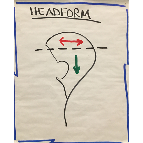
Headform 101
- The hair below the parietal ridge is stationary. This hair will mostly live in natural falling position unless your client is wearing her hair in a pony or an upstyle.
- The hair above the round of the head moves more. This is where you see beautiful movement and versatility within the color.
- Your client’s everyday style plays a role in color placement. Focus your attention and energy on the top area if you want to see movement in the end result.
Deep Versus Shallow
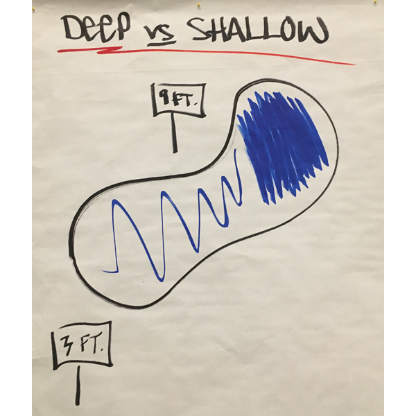
- Visualize a swimming pool to understand the deep versus shallow concept. Why does the water look so blue on the deep side? What can’t penetrate? Light! But then, when moving over to the 3-foot area, the same water looks different because light can penetrate through it.
- Side parts offer an automatic deep and shallow side. Place color accordingly—more foils on the deep side (maybe six or seven) and fewer foils on the shallow side (maybe three or four). Just like a pool needs more water on the deep side, the head needs more color on the deep side.
- Equal foils on each side of the head will create imbalanced color. When the client creates a side part, the shallow side will appear more solid while the deep side will look chunky.
Visual Weight
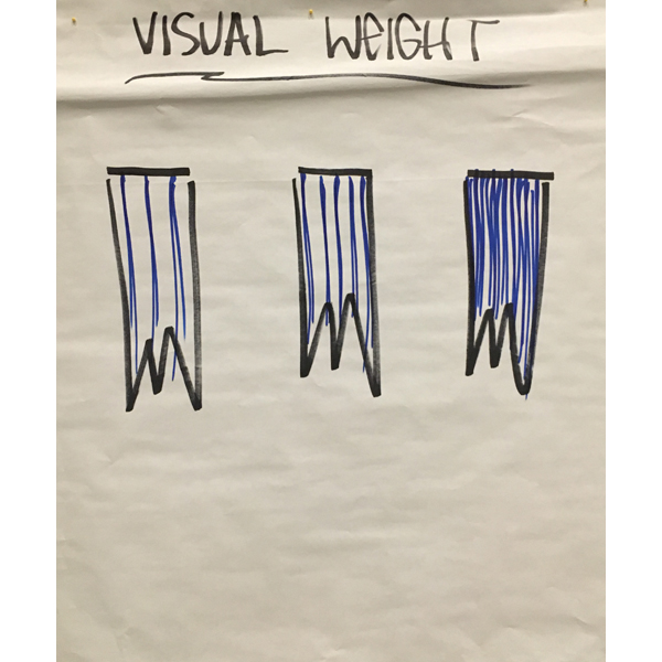
- Visual weight refers to color placement within the hair’s length. For example, look at the photo above. The first section has three lines of color, the second section has five lines of color and the third has 10 lines of color. Visual weight is stronger where there are more lines and less strong when there are fewer lines—keep this is mind when placing color on the length of the hair.
- What’s the goal? Ask yourself what kind of visual weight you (and your client) want to see in the final look. The answer will impact how the color is placed.
- Is the goal to have transparent color that blends and moves with other tones throughout the hair? If so, add in only a few lines of color. That way the color underneath the section will peek through more aggressively.
- Is the goal to have more saturation? If so, add more lines of color throughout the section. This will not allow as much color from the underneath sections to peek through.
More from
Redken
-
Celebrity
11 Questions With Celebrity Colorist Tracey Cunningham
-
Blonde
Lived-In Blonde With Warm Vivid Pops
-
Glossing/ Toning
How To Achieve “Glass Hair”: Smart Hacks From Hairdressers
-
Monthly Product Launch List
The Best Hair Launches Of March 2024
-
Blonde
The Biggest Hair Color Trends of 2024
-
Brunette
Caramel Chocolate Brunette With Gray Coverage
-
Awards Shows
The Best Celebrity Hair Colors & Formulas From The 2024 Golden Globes
-
Blonde
Guide To Gray: 5 Tips To Blend or Cover Stubborn Grays
-
News
How Maui Hairdressers Are Rebuilding Post-Lahaina Fires
-
Blonde
Blonde Ribboned Root Smudge
-
Balayage
Warm Glow Lived-In Blonde Balayage
-
BTC Hair Trend Report
Quiet Luxury Blonde: The “Old Money” Trend Explained
-
Blonde
Dear Colorists, Do You Enforce A Healthy Hair Policy?
-
BTC Hair Trend Report
Your Guide To Fall & Winter 2023’s Hair Color Trends
-
Blonde
Muted Honey Blonde
-
Industry News
Redken’s Safe Space Course Creates A More Inclusive Salon Experience
-
Haircare
ACIDIC BONDING CONCENTRATE 5-MINUTE LIQUID MASK
-
BTC Events
AI, Mental Health & Social Media: 7 Business Tips You Can’t Live Without
-
Copper
What Is The “Cowboy Copper” Hair Trend? Here’s What It Really Means…
-
Celebrity
Margot Robbie’s ’60s-Inspired Ponytail at the “Barbie” Premiere
-
Additive
4 Tricky Hair Color Scenarios & What You Should Do!
-
Gray Coverage
These 8 Steps Will Soften & Cover Grays In Just A Few Minutes
-
Hair Color
WWYD: How To Stop Your 6N From Turning Orange
-
Glossing/ Toning
Coral Crush

